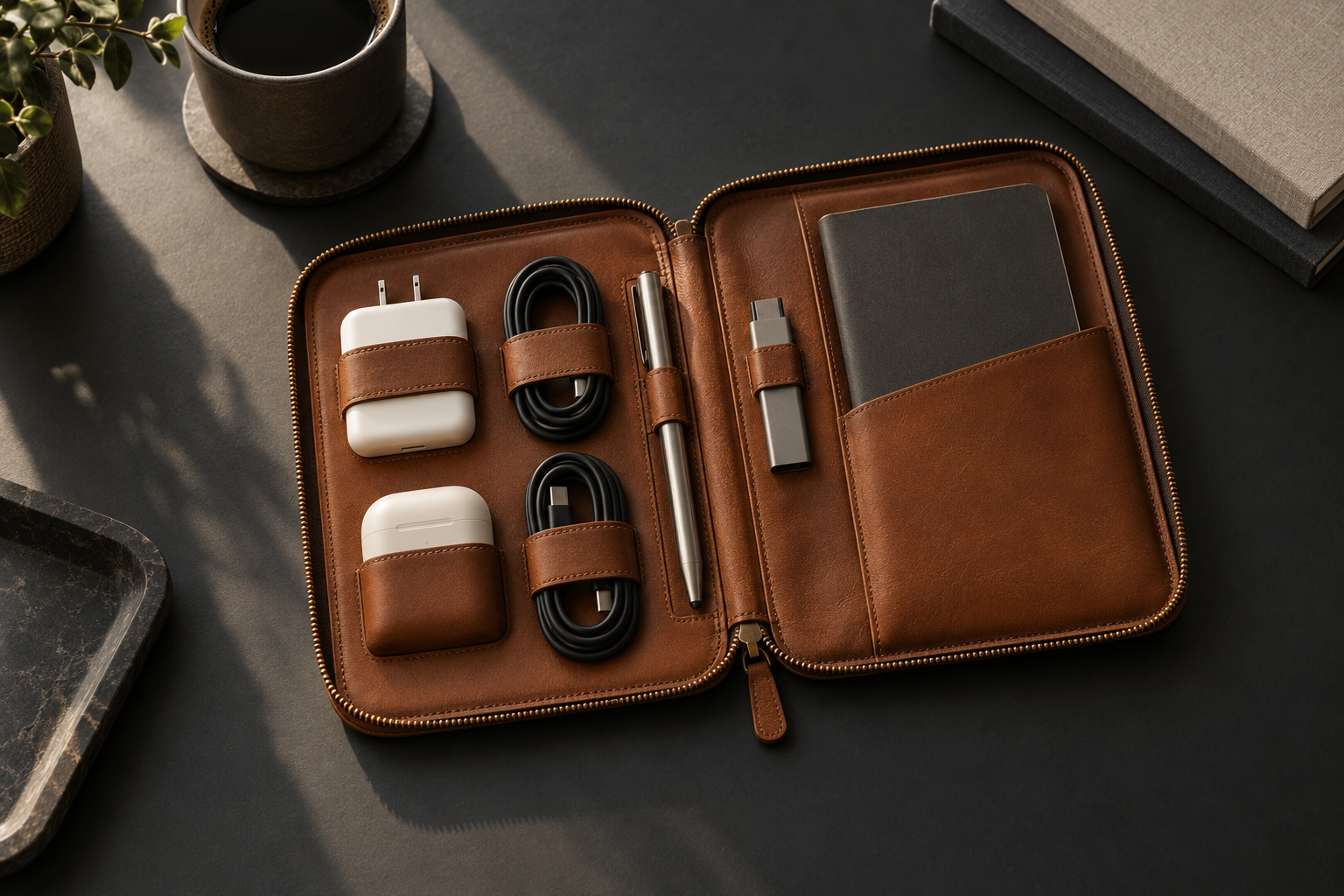
We tend to think of an organizer as a solution to clutter: collect the cables, charger, earbuds and adapters, then place them in one case. That can create visual calm inside a bag, but it does not necessarily create a good system. If half the contents must be removed to reach one item, if it is impossible to see what is missing before leaving, or if the layout works only on a desk and not in motion, the disorder has merely moved indoors.
Everyday-carry design begins with a different question: what happens between the moment a need appears and the moment the required object reaches the hand? That distance is made of attention, memory, search, opening, retrieval and return. Each step is small, but together they recur dozens of times a week. A quiet product reduces those steps without forcing its user to learn a new ritual.
This article does not claim that an organizer scientifically improves productivity. It uses established human-centred design and usability principles as a lens for a physical object. ISO 9241-210:2019, reconfirmed on May 22, 2025, emphasizes understanding users, tasks and context throughout a system’s life cycle. The standard addresses interactive systems; applying its logic to a carry object is a design interpretation, not a claim that the standard endorses a particular product.
1. Start with the journey, not the pocket count
A specification asks how many pockets there are. A use journey asks what a person is trying to do. In the morning, they want to confirm that essential equipment is present. In a meeting, they may need a pen or an adapter without laying out the entire bag. At an airport, they separate devices quickly. In the evening, they return objects so the system is ready for tomorrow.
The interior layout should therefore follow frequency and sequence. An item retrieved five times a day deserves direct access; a backup item can sit deeper. Objects that work together—a charger and cable, pen and notebook, earbuds and adapter—should be close enough for the relationship to remain obvious. Not every empty surface needs a pocket, and not every pocket creates utility.
This shift changes prototyping. Instead of beginning with a symmetrical drawing, begin with three ordinary days. List the objects that actually move, when they move and which objects tend to appear together. Then make the layout express that pattern. Geometry matters, but behavior comes first.
2. Turn recall into recognition
One of Jakob Nielsen’s best-known usability heuristics is “recognition rather than recall”: reduce memory load by making options visible when they are needed. The Nielsen Norman Group’s heuristics, first published on April 24, 1994 and reviewed again on January 30, 2024, were written for interfaces. Yet the principle provides a useful test for an organizer: can one opening reveal the state of the system?
Visibility does not require every object to be fully exposed. It means the user can quickly recognize what is present, what is missing and where to retrieve it. A mesh pocket for small items, a loop that establishes a cable’s home, and a deliberate distinction between heavy objects and flat ones all communicate information. Empty space becomes a signal: if the charger’s normal position is empty, that fact is visible before departure.
The alternative is an opaque stack. It may be compact, but it asks the user to remember which layer contains what, then disturb the arrangement to verify it. Density can be useful; hidden state is often expensive. The right balance depends on what must be checked and how quickly.
3. Design for stability before capacity
Maximum capacity sounds like an advantage, but a product that accepts everything may lose the pattern that makes it useful. A loose cable moves, a hard object strikes a delicate one, and every opening rearranges the contents. The important question is not only “How much fits?” but “What remains in place while the product moves?”
Stability comes from the relationship between dimensions, material and elasticity. A loop should hold without pressing against a connector. A pocket should protect without concealing. A heavy object should sit close to the structure rather than pulling at an unsupported wall. These are small mechanical decisions, but they determine whether the map survives a commute.
There is a counter-risk: a fit that is too precise becomes brittle when equipment changes. Chargers, earbuds and adapters evolve. A good organizer preserves its logic as those objects change. The solution is usually a combination of defined anchors for frequent essentials and one or two flexible zones for variation—not a custom socket for every object ever owned.
Open the organizer and look once. Can you immediately tell whether the charger, primary cable and earbuds are present? If not, the problem may not be discipline; the mapping may be unclear.
4. The opening is an interface
In a small physical product, the opening mechanism is the home screen. It determines the viewing angle, number of hands required, risk of objects falling and amount of surface area needed. A full opening offers a strong overview but may require a table. A partial opening can work while standing yet hide lower layers. There is no universally correct answer; there is a primary context.
Test three modes: standing, sitting at a desk and moving between places. Can the organizer open without spilling? Is the most frequent object available with one hand? Can the zipper pull, tab or closure be identified by touch? These tests reveal more than an immaculate studio image because they evaluate the object in the environments where it will live.
Opening also has a social dimension. During a meeting, a user may want to retrieve an adapter without creating a small performance on the table. On a flight, the available surface can be narrow. In a shared workspace, a clear interior can reduce the time a bag remains open. These are not luxury details; they are the actual boundary conditions of use.
5. Minimalism is hierarchy, not emptiness
Nielsen states another durable principle: irrelevant information competes with relevant information. In a physical product, another divider, clasp or loop can create the same competition. Good minimalism does not mean deleting features at random. It means deciding what should be immediately visible, what is secondary and what does not earn its place.
An organizer interior can be thought of as three layers: an immediate zone for high-frequency objects, a protected zone for delicate or valuable items, and a flexible zone for differences between days. When that hierarchy is legible, the user does not need to invent a new arrangement each time. When everything receives equal emphasis, everything becomes noise.
Visual restraint should also serve tactile clarity. Different textures, opening directions or edge shapes can distinguish zones without labels. The goal is not decoration. It is to let sight and touch carry some of the information that would otherwise need to be remembered.
6. Let material serve the job
“Premium” is not the name of a material. It is a fit between material, use and the way an object ages. An exterior must withstand handling and abrasion. A lining should protect electronics. Load points need reinforcement. Areas touching connectors or screens should avoid sharp hardware. Leather can develop character over time, but it also requires an appropriate specification, quality control and care. There is no magic material.
The environmental story also needs precision. The US EPA page updated June 23, 2026 recommends looking at materials across their whole life cycle—extraction, production, use, maintenance and end of life—and highlights reuse, maintenance and durability. It follows that an object intended to stay should be judged by its cleanability, repair options and replaceable parts, not only by its launch photograph. This is a framework, not an environmental certification of any product.
Material honesty matters commercially as well. A pre-production concept should say what is proposed and what remains to be validated. Final leather grade, lining, zipper, tolerances and color should be confirmed against production samples. A good story is specific about uncertainty instead of hiding it behind a mood board.
7. Design the return, not just the retrieval
A carry system succeeds only if objects are easy to return. A precise but awkward home will remain empty, while the cable returns to the bottom of the bag. The return cost therefore matters as much as retrieval: a short opening, an obvious destination and a holder that does not require a fight.
Build a small baseline: three to five objects that always return to the same positions. Around them, leave a variable zone for a particular day. The system then supplies consistency without becoming rigid. The ritual is not a major weekly reorganization; it is a thirty-second reset at the end of the day.
That reset has another benefit: it exposes failures. If an object repeatedly lands somewhere other than the place the design assigned to it, observe the behavior before blaming the user. The “wrong” position may be closer, easier or more naturally shaped. Repeated workarounds are design data.
How to test before manufacturing
A useful prototype does not need to look final. Cardboard, fabric, elastic bands and marking tape are enough to test size, sequence and movement. Build several configurations, use them for a week and record moments of searching, dropping, pressure or wasted space. Test different people and equipment, not only the designer’s own bag.
Simple measures can sharpen the discussion: time to locate the most frequent object; number of objects moved on the way to it; whether absence is visible at a glance; whether cables remain separated after travel; and how often a user returns an object somewhere else. The numbers are not absolute truth, but they replace aesthetic debate with observation.
Testing should include restraint. Remove one pocket and see whether anything gets worse. Change the orientation of a cable. Put the case in a narrow tote, backpack and suitcase. Try it with less than full capacity. Many objects look organized when full and collapse when half empty; ordinary days are usually the better test.
Quiet is the outcome
The value of an organizer is not the number of compartments or the impression it creates while empty. Its value appears in transitions: home to work, desk to meeting, routine day to travel. In those moments, good design almost disappears. The hand knows where to go, one look confirms that essentials are present, and returning them does not require another decision.
This is the quiet architecture of everyday carry: less memory, less search and less unnecessary motion; more visibility, stability and deliberate flexibility. Not order for a photograph, but a small system that respects the attention of the person using it.
Sources and methodology note
- ISO 9241-210:2019 — published July 2019; reconfirmed May 22, 2025. Its principles are adapted here as a design interpretation for a physical object.
- Jakob Nielsen, 10 Usability Heuristics — first published April 24, 1994; last reviewed January 30, 2024.
- US EPA, Sustainable Materials Management Basics — updated June 23, 2026.
The sources concern interfaces and material management. This article draws general design implications from them; it does not present a clinical experiment or a performance promise for a specific product.